
True Autumn: The Ultimate Guide

True Autumn colours are warm and rich.
They are probably the most recognisable colours from the season of the year that they are named after. These are literally the colours of autumn leaves — gold, burnt orange, russet.
They are also the colours of a very particular time of day, when the sun is setting. The shadows become long and the light like liquid gold, pouring across the landscape.
Besides autumn leaves and golden landscapes, we also see these colours in the earth, in forests, in deserts, on farms and in fields.
We see them in bugs, birds, amphibians, mammals, monotremes(!), you name it.
These are abundant colours of the natural, terrestrial world.
Related: Images in 12 Tones
The palette
True Autumn colours are rich, golden, earthy, fiery, and abundant.


In our 12 tone chart, True Autumn is the tone of complete warmth and richness, which influences the two Soft tones (Soft Autumn and Soft Summer) and the two Dark tones (Dark Winter and Dark Autumn). To all four it contributes earthiness, opacity and depth.
Where Spring-influenced colours have clarity, like light shining through coloured glass, thin and see-through, Autumn-influenced colours are opaque and 3-dimensional.
You don’t see through them, they’re too thick, like trees and earth and fur. They’re touchable, luxurious, sensual.
So where do True Autumn colours sit on the 3 dimensions of colour?
They are completely warm, so they contain yellow undertones, but no blue undertones at all.
They are medium-low in chroma (saturation), though they can appear brighter than they really are because our eyes are more reactive to warm colours.
Finally, the colours range from fairly light (beige) to fairly dark (deep brown). Overall, the palette is medium-dark.
Compared to True Spring, these colours are softer and darker overall, but share temperature (warm).
Compared to Soft Autumn, these colours are warmer, brighter, and slightly darker overall.
Compared to Dark Autumn these colours are warmer, softer and slightly lighter overall.

True Autumn colour dimensions
Clothing
If you’ve just discovered that you are a True Autumn, and you’re learning how to create a True Autumn wardrobe, congratulations! These are fabulous colours.
There’s no true black or white here, so this may be a big transition if you have a wardrobe full of them.
To replace black you have dark browns, but also deep warm navies, plums and khakis. The closest you have to true black is on the cover of your TCI fan, a kind of bronzed charcoal.
Your versions of white are variations on beige, cream and ecru.
Any colour in the fan will harmonise with any other (definitionally), so you can mix and match at will.
There are nearly infinite possible colour combinations, but to give you an idea, some combinations are shown on the last arm of your fan, some on the classic palette shown above, and some here:


And here are some examples of outfits for women and men in True Autumn colours:
Related: Women’s Fashion in 12 Tones
Related: Men’s Fashion in 12 Tones
For more inspiration, True Colour has a 12 Tone True Autumn Pinterest Board showing wardrobe ideas for men and women, as well as a blog post of palette-matched Cashmere Pashminas for Autumns.
Corporate Clothing
When I’m discussing corporate clothing here, I’m talking about more conservative workplaces — if yours is more casual, this may not be relevant for you.
That said, corporate clothing, in terms of colours, usually consists of some or all of these:
Neutral colours
Dark colours
High value contrast (light/dark)
The classic example is a grey or black suit with a white or light-coloured shirt or blouse, and possibly an accent colour in a tie or jewellery.
True Autumn doesn’t have those traditional colours, though there are greys, and your version of black on the cover of your TCI True Autumn fan. They have gold or green undertones, and if you can find them, great! However most greys I see tend to be cooler, better for Summers or Winters.
Nonetheless, you have plenty of options here.
As a medium-dark tone, you have plenty of darker colours to choose from. You also have many neutrals besides grey, like beiges, browns, khakis and olives.
There are some colour combination suggestions on the last arm of the TCI True Autumn corporate fan, and here are some more:


For more on corporate clothing, see True Autumn and True Spring Corporate Women from True Colour.
Patterns
Matching solid colours to your fan is one thing; matching patterns can be a trickier task.
If harmonising with the fan is too hard, try checking it against your face. If the colours are right, you’ll see the same effects you saw during your draping, like vitality, happiness, 3-dimensionality and authenticity.
What if most of the colours in a pattern are True Autumn, but there’s one that clearly isn’t? Does it matter?
Well, it depends.
Again, I’d check it against your fan and your face, and see if there’s overall harmony, or if the different colour is too disruptive.
As a rule of thumb, an off colours is less likely to ruin a print if it’s
a neutral, like brown or grey
from a nearby tone, like Soft or Dark Autumn
a smaller element in the print
As an example, the first pattern below contains only True Autumn colours. The second introduces small fronds in a True Summer blue, while the third has large blue fronds instead.
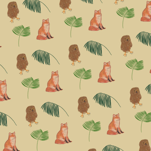
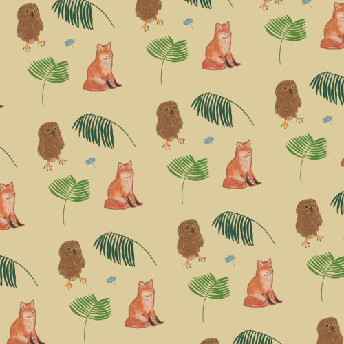
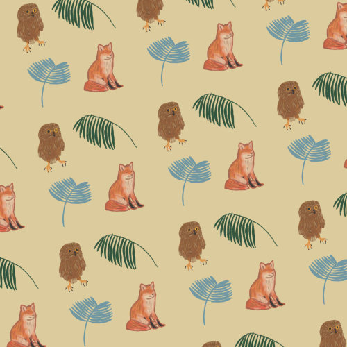
The first is perfect for you, obviously. The blue is clearly disharmonious, but so small in the second print that you could feasibly wear it. In the last one, however, it’s just too big to be ignored.
Metals, jewellery, watches and glasses
The best metals for True Autumn are gold, copper, brass and bronze. Silver, platinum and white gold are completely disharmonious with your absolute warmth, and will clash with your colours.
Metals that are slightly less reflective are especially good, like hammered, oxidised and antiqued. (As an aside, I’ve occasionally seen oxidised silver that has yellowed so dramatically that it harmonises with the True Autumn colours, a rare exception to the no-silver rule).
Beautiful stones for True Autumn jewellery include coral, amber, carnelian, moss agate, tiger eye, turqoise, rutilated quartz, jasper and calligraphy stone, as well as brown pearls and wooden beads. Rounded or raw stones are better than faceted, because autumn colours have more opacity, as discussed earlier.
Glasses frames can be any of the metals discussed above, or indeed any colour in the palette. Tortoiseshell is the autumn classic, for both eye glasses and sunglasses.
Hair colour
True Autumns naturally come in a wide range of hair colours, from caramel or gingered blonde to copper to auburn to warm brown, as you can see below.
Makeup
Complexion makeup (foundation, concealer, etc.) needs to be matched to your skin. If you have trouble finding or matching foundation, I have a blog post that might help.
The “colour makeup” comes from your True Autumn palette.

True Autumn neutrals
Your beiges, khakis and browns are your neutral eyeshadows, with gold and olive for variety.
Khaki (the autumnal version of taupe) is often the best brow colour, but brown is better for some.
Eye liners could be brown or olive.
Mascara is brown — you are far too warm to tolerate black.

True Autumn greens, blues and purples
If you like colourful makeup there are even more options, like a teal liner, forest green shadow or rich purple mascara.

True Autumn reds and oranges
Blush and lip colours come from the red and orange area of your palette. All will work on you, but most women will find their perfect shade is somewhere within this range, so trial and error may be necessary here.
Related: Makeup Looks in 12 Tones
True Autumns look amazing in makeup so warm that it would look like a sunburn on most people.
Orange and red blushes can be intimidating, but I’ve never seen them look less that stunning on your tone.
Bronzer, too, is a fabulous way to enhance the warmth of your colouring. True Autumn is, in fact, the tone that wears bronzer the most comfortably and most beautifully.
Natural looks are easy with all your beiges, peaches and browns, but drama is definitely possible too.
There’s plenty of depth in the palette to create warm smoky eyes, and deep russet or berries for a dramatic lip.
Matte finishes work beautifully with this muted palette, but metallic golds and bronzes are also lovely, in liners, shadows, even lipsticks or blushes (though not necessarily all together).
While a metallic blush can work, skin highlighters are not ideal. At your draping, in your own colours, you would have seen your skin looking young and smooth and perfect, and not shiny or dewy. That’s your best skin.
Highlighters have the potential to dull your eyes and make you look sweaty or oily.
Weddings
If you’re getting married, congratulations!
Wearing your suit or dress and accessories (like a boutonnière or bouquet) in your colours will bring out your best on your wedding day.
For True Autumn, suits can be in dark brown, warm navy, deep berry, or even beige for a lighter look. Avoid white shirts and choose beige or ecru instead. And choose any colour you like from the palette for ties and boutonnières. Stick to your neutrals for an elegant effect, or for more vibrance choose colours, like burnt orange, mustard yellow, tomato red or vivid teal.
A wedding dress in an antique cream or golden beige is perfect. Again, you can use cream flowers and brown and peach makeup for a tonal look, or add colour in the bouquet, jewellery, and makeup.
If you want to go all out, you can make your entire wedding themed in True Autumn colours. They make for a gorgeous, warm and welcoming wedding, as you can see below.
Related: Wedding Inspiration in 12 Tones
Living spaces
Autumn colours have been mainstays of interior decorating for as long as human beings have had homes to decorate. Most of our building materials and many of our decorating materials come in the colours of one or more of the three Autumn tones.
So on an almost ancestral level, they evoke feelings of warmth and comfort, safety and security.
Creating a True Autumn home is easy, as you can see below. The most frequent issue I see in collecting these images, is that of True Autumn decor but cold white walls. Get the paint colour right, and everything else should fall into place.
Related: Living Spaces in 12 Tones
Pin this:
