
Soft Autumn: The Ultimate Guide
Soft Autumn colours are subtle and magical, gentle and inviting.
Like all Autumn colours, these evoke earth and the natural world, but this is a gentle earth, more delicate and ephemeral than the full-bodied earth of True Autumn.
They remind me of the gumnut babies of my childhood, and the woodlands where fairies, nymphs and dryads hide in youthful imagination.
These are the colours of hazy days, of the Australian bush, desert plants, baby animals, tiny flowers and drying seeds.
They make for a beautiful gentle landscape, but the real magic is close up, in the intricate nuances of fur, feather, leaf, petal, bark.
Related: Images in 12 Tones
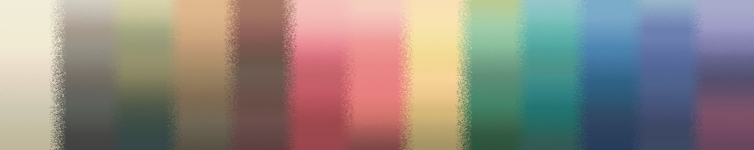
The palette
Soft Autumn colours are natural, gentle, organic, subtle and beautiful.


In our 12 tone chart, Soft Autumn falls on the path from True Autumn to True Summer. It combines True Autumn’s rich, earthy palette with a touch of Summer’s delicate serenity.
So where do Soft Autumn colours sit on the 3 dimensions of colour?
The colours are low in chroma (saturation).
The colours are neutral-warm, so they contain both yellow and blue undertones, but more yellow than blue.
Finally, the palette is medium in value, overall. There are, of course, lighter and darker colours but most of the colours are around the middle of the value scale.
Compared to Soft Summer these colours are warmer, but otherwise similar — both Soft tones are medium in value and, of course, soft.
Compared to True Autumn these colours are softer, cooler and slightly lighter overall.
Compared to Dark Autumn these colours are the same temperature — neutral-warm — but are softer and lighter.
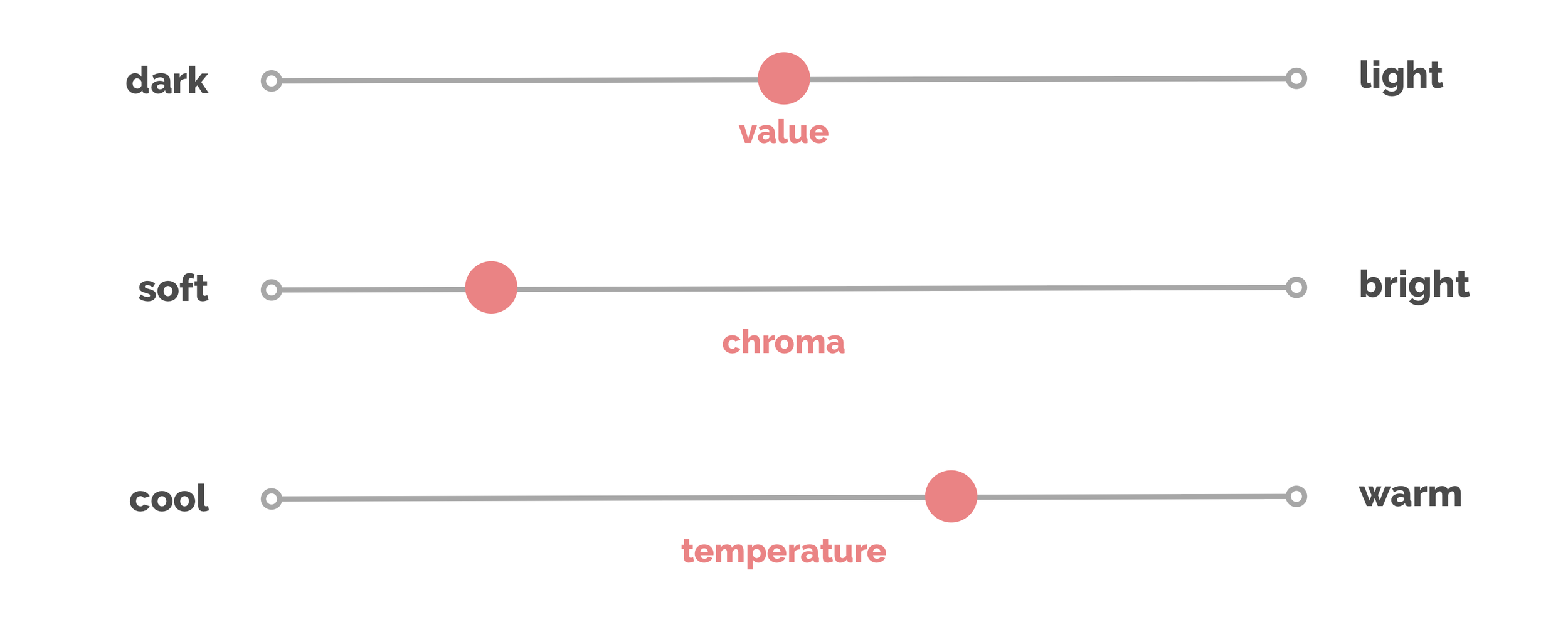
Soft Autumn colour dimensions
Amelia Butler at True Colour International has written some wonderful posts about understanding Soft Autumn colours, which I highly recommend reading:
The Velvet Revolution / Wabi Sabi
Hints and Tips for Using Your 12-Tone Colour Palette: Low Chroma
Where is the Orange?
Clothing
If you’ve just discovered that you are a Soft Autumn, and you’re learning how to create a Soft Autumn wardrobe, congratulations! These are beautiful colours.
They don’t include black and white, though, both of which are harsh and draining on your gentle colouring. For some Soft Autumns this alone can be quite a dramatic change.
To replace black you have dark browns and greys, and gentle navy blues. The closest you have to black is on the cover of your TCI fan, a kind of dusty warm dark grey.
Your versions of white are like unbleached cloth, in calico and canvas.
But you have so much to play with beyond your black and white analogues. Because your colours are so gentle, you can mix and match them endlessly, without ever looking overdone.
Some examples are shown on the last arm of your TCI Soft Autumn fan, and on the classic palette shown above. And here are some more:


Putting it all together, here are some examples of outfits in Soft Autumn colours for women and men:
Related: Women’s Fashion in 12 Tones
Related: Men’s Fashion in 12 Tones
For more inspiration, True Colour has a 12 Tone Soft Autumn Pinterest Board showing wardrobe ideas for men and women, as well as a blog post of palette-matched Cashmere Pashminas for Autumns.
Corporate Clothing
When I’m discussing corporate clothing here, I’m talking about more conservative workplaces — if yours is more casual, this may not be relevant for you.
That said, corporate clothing, in terms of colours, usually consists of some or all of these:
Neutral colours
Dark colours
High value contrast (light/dark)
You can, of course, use your “black” and “white”, discussed above, to create a similar effect.
Since neutral colours are legion in your tone, in browns, taupes, khakis, greys and beiges, those can also be used liberally to create your corporate look.
And while there aren’t as many dark colours as medium ones in the palette, there are some (and more in the corporate palette than the classic palette).
Examples of colour combination for corporate wear are on the last arm of the TCI Soft Autumn corporate fan, and here are some more:


For more on corporate clothing, see Soft Autumn Corporate Women from True Colour.
Patterns
Matching solid colours to your fan is one thing; matching patterns can be a trickier task.
If harmonising with the fan is too hard, try checking it against your face. If the colours are right, you’ll see the same effects you saw during your draping, like vitality, happiness, 3-dimensionality and authenticity.
What if most of the colours in a pattern are Soft Autumn, but there’s one that clearly isn’t? Does it matter?
It depends.
You’re more likely to get away with it if the non-Soft Autumn colour is:
closer to Soft Autumn, like True Autumn olive as opposed to Bright Winter lime
more neutral — an incorrect grey will be less problematic than an incorrect red
a small element in the print
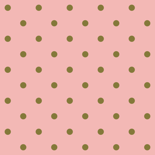
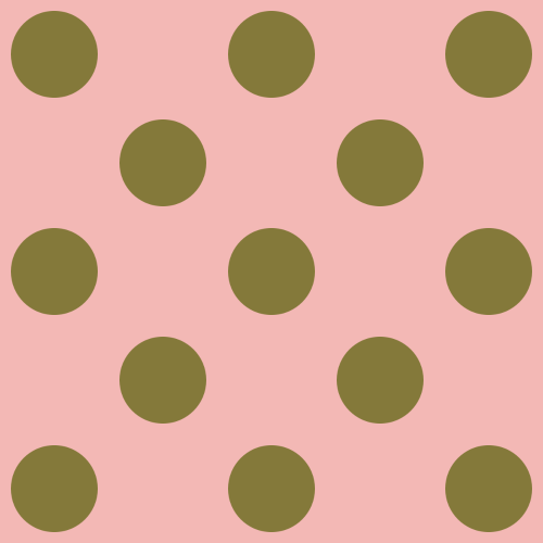
The patterns below are examples of the first and last case.
The polka-dot pattern on the left uses a Soft Autumn pink background and Soft Autumn khaki dots. The next replaces those with True Autumn olive dots. The third is the same as the second, but the dots are larger. And the last returns to the small dots, but replaces the olive with Bright Winter lime.

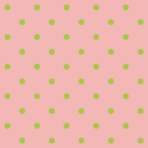
The first is perfect.
The second isn’t, but the dots are small and the colour is still somewhat muted, and so the overall effect is still more Soft Autumn than anything else. I’d wear it myself, as a fellow Soft Autumn, if I couldn’t find anything better.
The disharmony of the olive is more obvious when I enlarge the dots, and I’d be less likely to wear that print.
The last shows that when a colour is very wrong, even in a small size, the effect is unpleasant. (This is a prime example of the “effortfulness” of disharmonious colours; it’s hard work to look at.) Soft Autumn colours, being gentle and subtle, can be overwhelmed by bright colours very easily.
Metals, jewellery, watches and glasses
The best metals for Soft Autumn are soft and muted. Brushed, matte, satin and hammered metals are fantastic. Antiqued can be great too, as long as it isn’t overly blackened.
Silver, pewter, bronze, white gold, rose gold and soft yellow gold can all work as long as they are muted enough. Most coppers are too orange, but very occasionally you’ll see a pink copper which works.
Bright and shiny metals are like bright colours — they’ll overwhelm the natural, subtle magic of your colouring and flatten it into dullness. Above all else, avoid bling.
Wood and other natural materials also make great jewellery for Autumns.
Brown, cream and pink pearls, labradorite, rhodochrosite, rutilated or smoky quartz, jasper, moss agate, turquoise and coral can be beautiful stones for your colouring. Rounded or rough stones are usually better than faceted.
All the metals discussed above can work for glasses frames, as can any of the colours in the palette. Tortoiseshell is a particularly Autumnal frame, but be careful — many are too orange for Soft Autumn.
Hair colour
Soft Autumns naturally have a wide range of hair colours, from flaxen blonde to dark brown.
It’s very normal to see hair in this tone that is somewhere in the space between dark blonde and light brown, with highlights and lowlights in colours like barley, hazelnut, sand, antique gold, soft bronze or even copper.
It’s beautiful, nuanced and intricate, but it’s flattened into one-note blandness when surrounded by louder colours. Always worth remembering: if you’ve been wearing disharmonious colours, you don’t know what your natural hair colour really looks like.
Makeup
Complexion makeup (foundation, concealer, etc.) needs to be matched to your skin. If you have trouble finding or matching foundation, I have a blog post that might help.
The “colour makeup” comes from your Soft Autumn palette.

Soft Autumn neutrals
Neutral eyeshadows are most often produced in True and Soft Autumn shades, so you should have no trouble finding them. Your beiges, taupes, khakis and browns are all ideal for this.
Brow colours are usually in the khaki to taupe range, but occasionally dark brown for a dark-haired Soft Autumn, or light brown for gingery-haired one.
Eye liners are brown, but most brown liners available are too rich, in True and Dark Autumn shades.
Mascara, too, is brown. Again, many browns are too rich. Look for a muted, though still dark, brown.

Soft Autumn greens, blues and purples
If you like more colourful makeup, use any of the accent colours in your palette. The greens will bring out the green in many Soft Autumn eyes, in shadow or liner, and the pinks are very wearable around the eyes in this tone especially.

Soft Autumn reds and pinks
Blush and lip colours come from the red and pink area of your palette, in colours like soft peach, muted berry, dusty pink and pale brick. All will work on you, but most women will find their perfect shade is somewhere within this range, so trial and error may be necessary here.
Related: Makeup Looks in 12 Tones
Soft Autumn colours make natural looks effortless. So much so that these are the colours offered as “natural” for any woman, from myriad makeup brands. On others it will look anywhere from inoffensive to dull, but you will look fresh, glowy and vital.
Dramatic looks are possible too, of course, simply by dipping into the deeper areas of the palette, as in brown smoky eyes or deep (but soft) berry lips.
As for all Autumns, bronzer can be a beautiful product for you. Not the orangey ones, which are for True Autumn, or the burnt red ones, for Dark Autumn. Soft Autumn’s is a pinker, dustier bronze.
Shimmer in your products is something to be careful of. Like shiny metals and bright colours, it can easily overwhelm your gentle colouring.
In your own colours, your eyes will sparkle and your skin will have a gentle glow.
Add makeup that is shinier than you are, and you’re likely to reduce the sparkle in your eyes by comparison.
A subtle sheen is the most I’d recommend for daytime. At night, when the light is dim and cannot reflect so intensely, shimmers can be more wearable.
Weddings
If you’re getting married, congratulations!
Wearing your suit or dress and accessories (like a boutonnière or bouquet) in your colours will bring out your best on your wedding day.
A Soft Autumn suit could be in your warm dark grey, navy, rosewood brown, deep khaki-brown, or hunter green. In some of the images below a white shirt is shown, because they’re so ubiquitous as to be unavoidable. Choose your bone or calico instead.
For a classic wedding dress you can go with your warm off-whites, or blush, sand or pale gold shades. For a more original, colourful wedding, you could choose cornflower blue, light dusty turquoise or antique peach.
Using these colours throughout your wedding, from flowers and table settings to bridesmaids’ dresses and groomsmen’s suits, will create a harmonious, inviting, beautiful and authentic wedding.
Related: Wedding Inspiration in 12 Tones
Living spaces
Autumn colours feel inviting and homely to most people, because they are the colours of the bricks, stones, woods, furs and fabrics with which we (as a species) have traditionally built and decorated our homes.
Soft Autumn homes in particular have a gentle, cosy, welcoming feeling, as you can see below.
Related: Living Spaces in 12 Tones
Pin this:
