
Soft Summer: The Ultimate Guide
Soft Summer colours are simultaneously gentle and mysterious.
They speak to me of misty or foggy landscapes, days when the noises of the world are muffled and the path in front of you nebulous, when every step could reveal something unexpected.
They’re magical, but not in a sparkly, showy way.
This is a subtle kind of enchantment.
Related: Images in 12 Tones
The palette
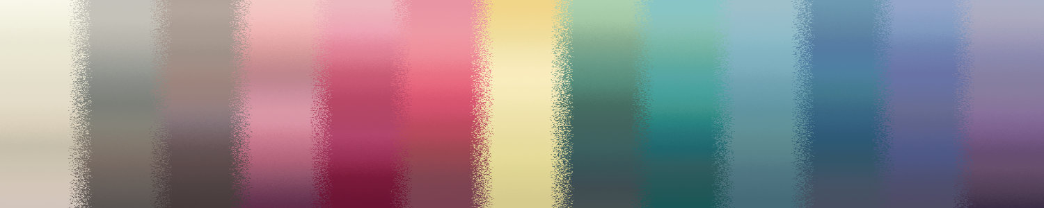
Soft Summer colours are subtle, ethereal, calm, gentle and beguiling.

In our 12 tone chart, Soft Summer falls on the path from True Summer to True Autumn. It combines True Summer’s exquisite, refined palette with just a touch of Autumn’s earthiness. Not enough that Soft Summer appears earthy, just enough to give a sense of depth and tactility.
So where do Soft Summer colours sit on the 3 dimensions of colour?
The colours are low in chroma (saturation).
The colours are neutral-cool, so they contain both blue and yellow undertones, but more blue than yellow.
Finally, the palette is medium in value, overall. There are, of course, lighter and darker colours but most of the colours are around the middle of the value scale.
Compared to Soft Autumn these colours are cooler, but otherwise similar — both Soft tones are medium in value and, of course, soft.
Compared to True Summer these colours are softer, warmer and slightly darker overall.
Compared to Light Summer these colours are the same temperature — neutral-cool — but are softer and darker
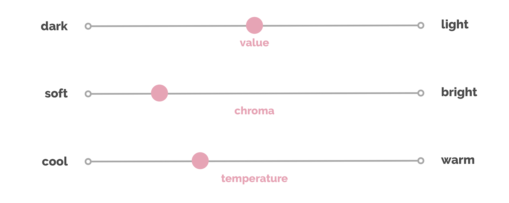
Soft Summer colour dimensions
Amelia Butler at True Colour International has written some wonderful posts about understanding Soft colours, which I highly recommend reading:
The Velvet Revolution / Wabi Sabi
Hints and Tips for Using Your 12-Tone Colour Palette: Low Chroma
Clothing
If you’ve just discovered that you are a Soft Summer, and you’re learning how to create a Soft Summer wardrobe, congratulations! These are beautiful colours.
They don’t include black and white, though, but rather off-white and deep grey. True black and white are too sharp and harsh for your colouring, but I know it can be a dramatic change to move away from them.
Some fabrics do not hold intense colours well, and so “black” on those often will, in fact, work for you (black jeans come to mind).
(As an aside, if you have black or slightly too bright clothing in natural materials, sometimes soaking in lemon juice and hanging on the clothesline for a few days in bright sun can bring them into your tone. One of the many advantages of being a Soft — clothes can actually improve over time.)
But of course, you have so much more to explore beyond off-white and deep grey.
Indeed, since any colour in the palette goes with any other (that’s the point of the 12 tones), your colour combining options are almost unlimited.
You’ll do equally well in subtle gradations of taupe (a surprisingly magical shade on every Soft Summer I’ve seen), as in colourful combinations of cornflower blue and yellow, or eggplant, blush and turquoise.
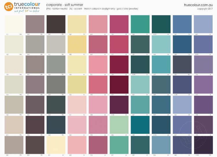
Some examples of possible combinations are shown on the last arm of your TCI Soft Summer fan, and on the classic palette shown above. And here are some more:


Putting it all together, here are some examples of outfits in Soft Summer colours for women and men:
Related: Women’s Fashion in 12 Tones
Related: Men’s Fashion in 12 Tones
For more inspiration, True Colour has a 12 Tone Soft Summer Pinterest Board showing wardrobe ideas for men and women, as well as a blog post of palette-matched Cashmere Pashminas for Summers.
Corporate Clothing
When I’m discussing corporate clothing here, I’m talking about more conservative workplaces — if yours is more casual, this may not be relevant for you.
That said, corporate clothing, in terms of colours, usually consists of some or all of these:
Neutral colours
Dark colours
High value contrast (light/dark)
You can, of course, use your “black” and “white”, discussed above, to create a similar effect.
But many colours in the palette can be used in credibly corporate combinations — your many mushrooms, taupes and greys are perfect neutral basics, and your soft navy can also work well for this purpose.
Even your more colourful colours, being soft, will rarely read as too frivolous for a workplace, especially if mixed with one of your neutrals or deeper colours.
You’ll find examples of colour combinations for corporate wear on the last arm of the TCI Soft Summer corporate fan; here are some more:


For more on corporate clothing, see Soft Summer Corporate Women from True Colour.
Patterns
Matching solid colours to your fan is one thing; matching patterns can be a trickier task.
If harmonising with the fan is too hard, try checking it against your face. If the colours are right, you’ll see the same effects you saw during your draping, like vitality, happiness, 3-dimensionality and authenticity.
What if most of the colours in a pattern are Soft Summer, but there’s one that clearly isn’t? Does it matter?
It depends.
You’re more likely to get away with it if the non-Soft Summer colour is
Closer to Soft Summer, like True Summer pink or Soft Autumn blue, but not Bright Spring orange
More neutral — an incorrect grey will be less problematic than an incorrect red
A small element in the print
In the patterns below you can see how this plays out.
In the first, all elements of the print are in Soft Summer colours. In the second, a raindrop is added in a Bright Spring turquoise. And in the last, one of the umbrellas is coloured a Bright Spring orange instead of the Soft Summer red it is in the other two patterns.


The first pattern is obviously perfectly harmonious, and would be beautiful for you. In the second, the turquoise drop is dissimilar from the rest, but it’s small and not too noticeable. The last, though, is dreadfully uncomfortable — avoid!
Metals, jewellery, watches and glasses
The best metals for Soft Summer are soft and muted. Brushed, matte, satin and hammered metals are fantastic. Antiqued can be great too, as long as it isn’t overly blackened.
Silver and white gold are usually best, but because you are neutral-warm and therefore have some yellow in your undertones, yellow gold is also possible. I find that it has to be a particular gold though, avoiding orangey, deep and rich versions of the metal. Rose gold sometimes works too, on the pinker side, rather than the more common peachy tone.
Bright and shiny metals are like bright colours — they’ll overwhelm the delicate beauty of your colouring and flatten it into dullness.
Beautiful stones for Soft Summer jewellery can include pearls, rose and smoky quartz, amethyst, blue lace agate, moonstone, rhodochrosite and rhodonite, all of which come in rounded cabochons. Some other gems, like diamonds, can be harmonious in their rough form, but the faceted stone is far too bright and shiny.
All the metals discussed above can work for glasses frames, as can any of the colours in the palette.
Hair colour
I have seen natural Soft Summer hair colours from pale blonde to dark ash brown, and all the increments in between.
Like their Soft Autumn siblings, the apparent depth of Soft Summers is highly variable.
The apparent colour of the hair can be somewhat mercurial, as I see myself on my Soft Summer son. When he wears Winter colours his hair appears dull and mousy, and quite dark. In his own colours it lightens, but also displays its true complexity, with lots of highlights and lowlights and subtle gradations.
Makeup
Complexion makeup (foundation, concealer, etc.) needs to be matched to your skin. If you have trouble finding or matching foundation, I have a blog post that might help.
The “colour makeup” comes from your Soft Summer palette.

Soft Summer neutrals
Your neutral eye makeup colours, for shadow, liner and brows are your taupes, mushroom browns and greys.
Mascara is dark grey or dark taupe. Some mascaras I’ve seen labelled “Black-Brown” are in fact a dark purplish-taupe shade which would work well for you.

Soft Summer greens, blues and purples
For more colour, any of the accent colours in your palette can be used. The purples often appear surprisingly natural around the eyes. And a navy or deep sea green liner can bring out the blue or green colours that are common in Soft Summer eyes.

Soft Summer reds and pinks
Blush and lip colours come from the red and pink area of your palette. Most will work on you, but you will likely find that your perfect shade is somewhere within this range, so expect some trial and error.
Related: Makeup Looks in 12 Tones
Natural looks are easy with such a gentle palette, but there’s also plenty of depth here for more dramatic looks.
The deeper end of the red range goes surprisingly dark, in some plum and berry shades that make for a captivating lip colour.
Smoky eyes also works here, though not in the black-and-grey-sooty way of Winter. Call them misty eyes instead.
As a Soft, beware of too much shine in your makeup. One doesn’t see sparkle on a foggy day — the two are inimical. In your own colours you will have the kind of gentle glow of that foggy day, but that glow can be obliterated instantly by a very sparkly or shiny makeup.
Satin finishes are usually better than metallic or glossy, but check them on your skin before buying.
Shimmer is more wearable at night, when there is less light to reflect, and so the sparkle is tamed.
Weddings
If you’re getting married, congratulations!
Wearing your suit or dress and accessories (like a boutonnière or bouquet) in your colours will bring out your best on your wedding day.
A Soft Summer suit could be in your dark grey, mushroom, driftwood, plum or navy. In some of the images below a white shirt is shown, because they’re so ubiquitous as to be unavoidable. Choose one of your off-whites, like cotton or chalk, instead.
Your wedding dress could be in a soft white, blush or pale dove. For a more modern look, any of your colours work, like dusty blue, lavender or misty pink.
You can also use these colours for your decorations, venue, and bridal party, for a beautiful, fairy-tale wedding.
Related: Wedding Inspiration in 12 Tones
Living spaces
Soft Summer colours have been the palette du jour in interior design for the last several years. Millennial pink, taupe and faded turquoise have been everywhere, and for good reason.
These take the inviting cosiness of Autumn but add a good dose of cool, calm serenity, and make for beautiful homes, as you can see below.
Related: Living Spaces in 12 Tones
Pin this:
