
Bright Spring: The Ultimate Guide
Bright Spring is life in vivid, sparkling relief.
From tropical waters to greek islands, from tulip fields to an arctic sunrise, these are the most energetic colours of the 12 tones.
Related: Images in 12 Tones
The palette
Bright Spring colours are clear, vivid, sparkling, fun and exuberant.
In our 12 tone chart, Bright Spring falls on the path from True Spring to True Winter. It combines Spring’s bright, sunny palette with a touch of Winter’s icy contrast.
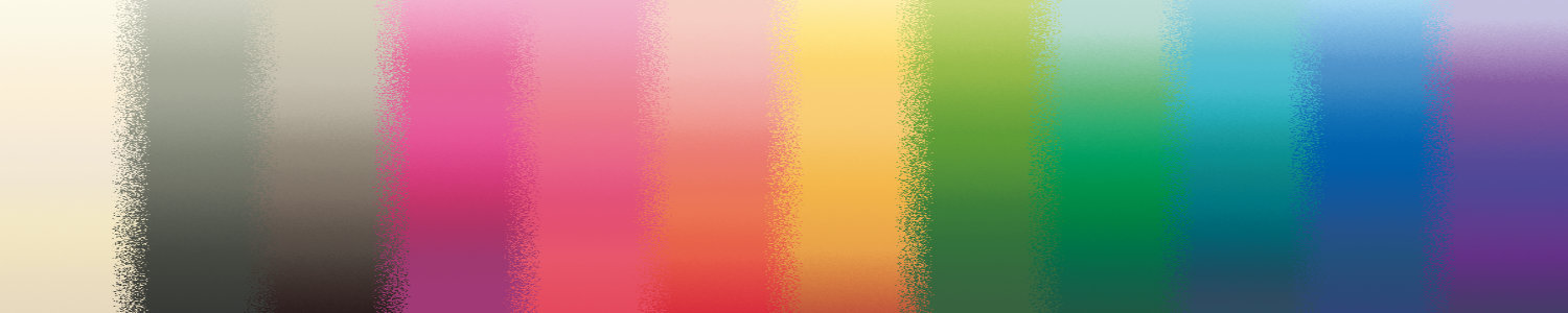
So where do Bright Spring colours sit on the 3 dimensions of colour?
The colours are very high in chroma (saturation).
The colours are neutral-warm, so they contain both yellow and blue undertones, but more yellow than blue.
Finally, the palette ranges from very light to very dark, but most of the colours are medium in value, leaning slightly to the light side because of the greater concentration of yellow undertones.
Compared to Bright Winter these colours are similarly bright, but warmer and slightly lighter overall.
Compared to True Spring these colours are cooler, brighter, and slightly darker overall.
Compared to Light Spring these colours are the same temperature — neutral-warm — but are brighter and darker overall.

Bright Spring colour dimensions
Clothing
If you’ve just discovered that you are a Bright Spring, and you’re learning how to create a Bright Spring wardrobe, congratulations! These are fabulous colours.
Because you have a Winter influence, you can tolerate black. Given that most of us have a lot of black in our wardrobes before our PCA, this can make the transition substantially easier.
Your particular version of black is on the cover of your TCI Bright Spring fan — a slightly yellowed charcoal rather than the inky blue-black of Winter. If you can find your perfect “black”, wear it with abandon!
Otherwise, mix your blacks with some of your other colours, to lighten, brighten and warm the outfit to harmonise with your colouring. I recommend no more than 50% of an outfit be black, preferably less, and that you have some other colour somewhere near your face.
Here are some examples of your colours combined with black:


As you expand your Bright Spring wardrobe over time, you’ll be able to assemble outfits without black, using your gorgeous warm greys, taupes, creams and ivories for neutral bases, and adding as much of a vivid colour or two as you’re comfortable with. Or, for the more adventurous, experiment with colourful combinations, like these:


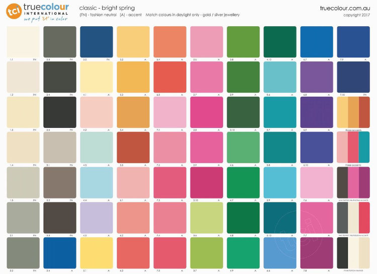
Some more combination examples are shown on the last arm of your TCI fan, and on the classic palette shown above.
Translating all this into actual outfits, here are some examples in Bright Spring colours for both women and men:
Related: Women’s Fashion in 12 Tones
Related: Men’s Fashion in 12 Tones
These are just colours and styles that I can find; use your colours however you like, in whatever styles suit you.
For more inspiration, True Colour has a 12 Tone Bright Spring Pinterest Board showing wardrobe ideas for men and women, as well as a blog post of palette-matched Cashmere Pashminas for Springs.
Corporate Clothing
When I’m discussing corporate clothing here, I’m talking about more conservative workplaces — if yours is more casual, this may not be relevant for you.
That said, corporate clothing, in terms of colours, usually consists of some or all of these:
Neutral colours
Dark colours
High value contrast (light/dark)
The classic example is a grey or black suit with a white or light-coloured shirt or blouse, and an accent colour in a tie or jewellery.
This is achievable for you simply by replacing the white with your ivory, and using your versions of black or grey when you can find them. If you can’t, make sure to mix in some of your own colours to warm and brighten your outfit, as discussed in the clothing section above.
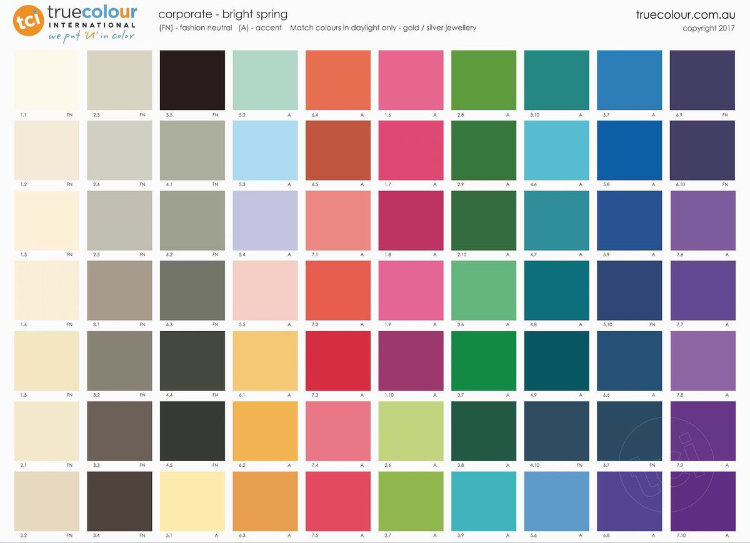
Below I’ve chosen some combinations, drawn entirely from your palette, which as you can see are perfectly professional.


There are other examples of colour combinations for corporate wear on the last arm of the TCI Bright Spring corporate fan.
For more on this, see Bright Spring Corporate Women from True Colour.
Patterns
Matching solid colours to your fan is one thing; matching patterns can be a trickier task.
If harmonising with the fan is too hard, try checking it against your face. If the colours are right, you’ll see the same effects you saw during your draping like vitality, happiness, 3-dimensionality and authenticity.
What if most of the colours in a pattern are Bright Spring, but there’s one that clearly isn’t? Does it matter?
Yes, but it can be workable for you, or not, depending on:
how large or small the disharmoniously-coloured element is
how close the colour is to your palette, so a bright but slightly warm or cool colour will be much more acceptable than a soft colour
whether the colour is neutral or not, neutrals usually being less obviously wrong
In the first pattern below, the ladybirds (ladybugs for my American readers) are in Bright Spring colours, as is the background.
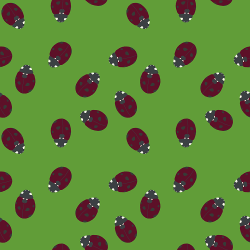
In the second, the occasional ladybird is instead in True Summer colours, and in the third they all are.
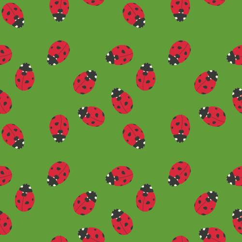
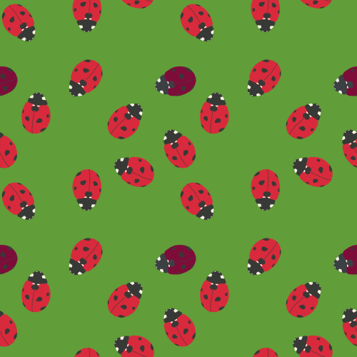
The first, being entirely Bright Spring, is perfect for you.
In the second the mis-coloured ladybirds are noticeably disharmonious to my eye, but they’re small and mostly overwhelmed by the Bright Spring colours that surround them. It’s not as good as the first pattern, but I think you could get away with it.
The last is too disharmonious to look good on anyone, whether Bright Spring, True Summer or any other tone.
A note of caution with patterns — medium to large prints often work better, depending on the colours involved.
Small elements of different colours can mix visually, making the colours appear softer, as you can see in the patterns below.
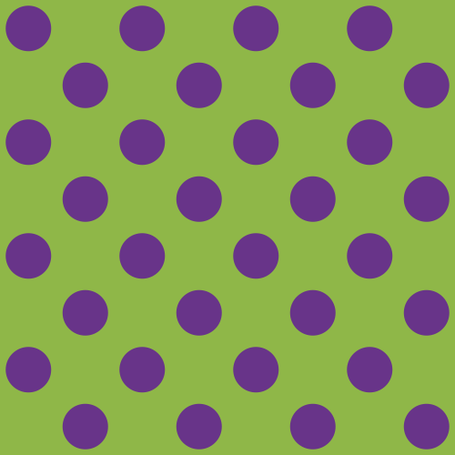
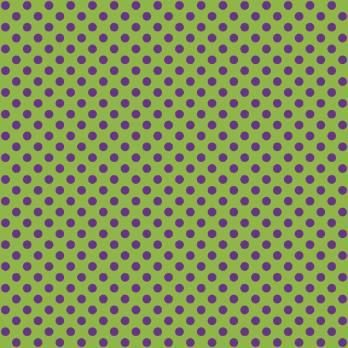

These are all the same pattern, just at different sizes.
At some point the colours will start to mix together, so you no longer see the purple and green as separate colours. Instead they create an Autumnal green, which is no longer harmonious with Bright Spring. The size at which the colours start to mix will depend on the size of your screen and your distance from it.
It’s easier to make sure that your colours stay Bright Spring by choosing patterns on the medium to large scale.
Metals, jewellery, watches and glasses
The best metals for Bright Springs are shiny. Many metals can work, including gold, rose gold, white gold, silver and platinum, but they all work best with a shiny or polished finish. “Bling” is perfect for both Bright tones.
Avoid antiqued and oxidised finishes, which appear dark and earthy. Earthiness is Autumnal, as opposed to the sunniness of Spring that you’re looking for.
Beautiful stones for Bright Spring jewellery include opal, yellow sapphire, topaz, diamond, zirconia, emerald, andesine, citrine, golden beryl, spessarite, sunstone, chalcedony and many colours of swarovski crystals. Faceted stones are better than rounded or raw, because the faceting increases the brilliance of the colour, making them harmonise better with your bright colours.
All the metals discussed above can work for glasses frames, as can any of the colours in the palette. Colourful frames are especially wonderful on Springs.
Hair colour
Bright Spring natural hair colours are most often brown, though red and blonde are also possible.
Makeup
Complexion makeup (foundation, concealer, etc.) needs to be matched to your skin. If you have trouble finding or matching foundation, I have a blog post that might help.
The “colour makeup” comes from your Bright Spring palette.

In my experience, medium to dark neutral eyeshadows are hardest to find for Bright Springs. Most greys are too cool and most taupes too brown, but if you can find your greys and taupes, they will make wonderful shadows. Similar colours are great for brows.
Lighter neutrals are easy and abundant, creams and champagnes abound for lovely eyeshadow highlights.
Eyeliner and mascara are dark taupe or charcoal. True black is darker and colder than your best version. If you choose to use it, use warmer and lighter shadows to compensate.

More colourful eyeshadow is often easier to find than neutral. Golds, peaches and corals are particularly beautiful, and can look surprisingly natural. Other colours will make more of a dramatic statement, but can be more wearable as liner — I especially love a turquoise liner on a Bright Spring.

Blush and lip colours come from the pink, peach, coral and orange area of your palette. All will work on you, but most women will find their perfect shade is somewhere within this range, so expect some trial and error.
Related: Makeup Looks in 12 Tones
Bright Spring colours easily create natural, glowy looks, using on the champagne and peachy colours of the palette. Amp them up with brighter coral or pink lips for a summery look.
Pin-up looks are also easy, using brighter corals or orange-reds for lips and greys for the eyes.
Bronzers can work, as long as they’re not muddy (Autumn) or greyed (Soft) in colour — look for peachy or yellower shades.
Glowy products are wonderful for Bright Springs, including highlighters, glosses and dewy foundations. If you are worried about oily skin, focus glowy effects in specific places like your eyelids, lips and/or tops of cheekbones.
Be careful with overly matte, dry-looking products, and avoid over-powdering.
You can see the products I use for Bright Springs, plus curated palettes and eye looks, in my post Bright Spring Makeup Kit.
Weddings
If you’re getting married, congratulations!
Wearing your suit or dress and accessories (like a boutonnière or bouquet) in your colours will bring out your best on your wedding day.
A Bright Spring suit could be in your version of black, or any of your greys. If wearing a white shirt, find your creamy white rather than the blue-white of Winter.
For your wedding dress choose ivory, coconut or champagne. Light peach is a colourful but still light alternative. For a more modern, colourful dress, turquoise or coral are lovely.
To create an entirely Bright Spring wedding, use your colours for bridesmaids’ dresses and groomsmen’s suits, your cake and flowers, and all your venue decorations. As you can see below, they create a gorgeous, fun, joyful wedding atmosphere.
Related: Wedding Inspiration in 12 Tones
Living spaces
Bright Spring colours are not commonly used for interior design, because most people choose more subtle colours for their homes.
It takes a confident touch to use such bright colours, but the reward is clear: a joyful, delightful place to live.
Related: Living Spaces in 12 Tones
Pin this:
