
Bright Winter: The Ultimate Guide

Bright Winter colours are extreme. They are all “very”.
Very bright or very light or very dark.
Because there is no middle ground here, these colours are not especially common in the natural world. But they do exist, as you can see in the Pinterest board below.
You can see them in the animal world, in birds, frogs, reptiles and jellyfish.
You can see them in flowers like fuchsias, petunias, lobelias and azaleas.
And you can see them at the poles of the earth, in auroras like the northern and southern lights.
Related: Images in 12 Tones
The palette
Bright Winter colours are clear, vivid, powerful, striking and fun.

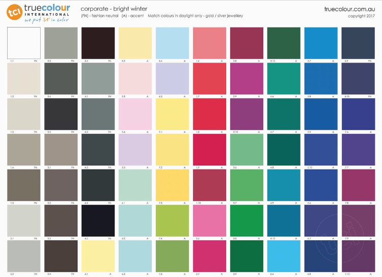
In our 12 tone chart, Bright Winter falls on the path from True Winter to True Spring. It combines True Winter’s sharp, cool and contrasting palette with a dash of Spring sunshine.
So where do Bright Winter colours sit on the 3 dimensions of colour?
Firstly, and most obviously, the colours are very high in chroma (saturation).
The colours are neutral-cool, so they contain both blue and yellow undertones, but more blue than yellow.
Finally, the colours range from very light (bright white) to very dark (black), but the majority of the colours are medium in value, leaning slightly to the dark side because of the greater concentration of blue undertones.
Compared to True Winter these colours are, overall, brighter, warmer and slightly lighter.
Compared to Bright Spring these colours are similarly bright but, overall, cooler and slightly darker.
Compared to Dark Winter these colours are the same temperature — neutral cool — but are overall brighter and lighter.

Bright Winter colour dimensions
For more about Bright Winter colours, see In Search of 12-Tone’s “Icy” Lights and How Dark Can Bright Winter Colours Go? from Amelia Butler at True Colour International.
Clothing
If you’ve just discovered that you are a Bright Winter, and you’re learning how to create a Bright Winter wardrobe, congratulations! These are spectacular colours.
If they seem intimidating at first, just remember that you can not only tolerate them, but in fact need them to look as vital and 3-dimensional as you really are.
The good news is that, as a Winter, black is in your palette.
The vast majority of my clients have a wardrobe filled with black before their personal colour analysis. For many, black doesn’t work and so the wardrobe transformation is a big job.
But for you, dear Bright Winter, your black clothes are a perfect jumping off point.
Your black is slightly different to the midnight black of True Winter, and is represented on the cover of your 12-tone fan. The differences are very subtle though, so much so that realistically they’re interchangeable.
However, black alone, or black and white alone, often seems too cool on a Bright Winter, and is better on a True Winter. Adding even a touch of another colour from your palette will lift your outfit into harmony with you.
This accent colour can be added in a t-shirt, a scarf, a piece of jewellery, even a lipstick.
Of course, you need not stick to your neutrals with just a touch of colour. The magic of the 12 tones is that when you know your colours, you can wear any of them, and mix them however you like. But if you need a starting point, black and white and an accent colour is a fool-proof option.
One of the primary features of the Winter tones is highly contrasting colours, and so Winter people look great in outfits that utilise them.
By high contrast I mean combinations like:


As you accumulate more of your colours, I’d recommend moving away from predominantly black outfits. The element of Spring in your colouring needs light and colour to look best.
Rule of thumb, I prefer no more than 50% of a Bright Winter outfit to be black.
If you have a TCI Bright Winter fan, you’ll see some ideas about how to combine colours on the last arm of fan. (You can also see some on the classic palette image further up this page.) You can combine your colours however you like, but they’re some ideas to get you started.
As are these Pinterest boards of Bright Winter outfits for women and men.
Related: Women’s Fashion in 12 Tones
Related: Men’s Fashion in 12 Tones
For more inspiration, True Colour has a 12 Tone Bright Winter Pinterest Board showing wardrobe ideas for men and women, as well as a blog post of palette-matched Cashmere Pashminas for Winters.
Corporate Clothing
When I’m discussing corporate clothing here, I’m talking about more conservative workplaces — if yours is more casual, this may not be relevant for you.
That said, corporate clothing, in terms of colours, usually consists of some or all of these:
Neutral colours
Dark colours
High value (light/dark) contrast
The classic example is a grey or black suit with a white or light-coloured shirt or blouse, and an accent colour in a tie or jewellery.
This is easy to do for all of the Winters.
The combinations I showed above could all work for corporate environments.
There are more combinations on the last arm of the TCI Bright Winter corporate fan.
And here are some more:


For more, see Bright Winter Corporate Women from True Colour.
Patterns
Matching solid colours to your fan is one thing; matching patterns can be a trickier task.
If harmonising with the fan is too hard, try checking it against your face. If the colours are right, you’ll see the same effects you saw during your draping, like vitality, happiness, 3-dimensionality and authenticity.
What if most of the colours in a pattern are Bright Winter, but there’s one that clearly isn’t? Does it matter?
Again, I’d check it against your fan and your face, and see if there’s overall harmony, or if the different colour is too disruptive.
As an example, the first pattern below contains just Bright Winter colours. The second introduces small spots of a Soft Autumn pink, and the third spreads that pink to cover the entire background.
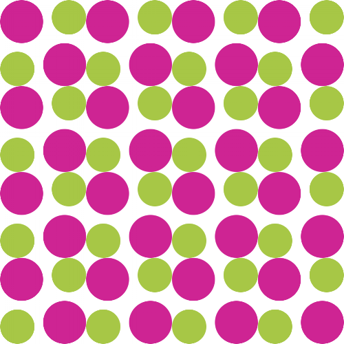


While the first is obviously the best, you could get away with the second. The disharmonious colour is in a small area and the Bright Winter colours are much more noticeable. I find the last option very uncomfortable to look at, and wouldn’t inflict it on anyone!
One note of caution with patterns in brighter tones — medium to large prints often work better, depending on the colours involved.
Small elements of different colours can mix visually, softening the colours, and therefore reducing the harmony, as you can see in the patterns below.

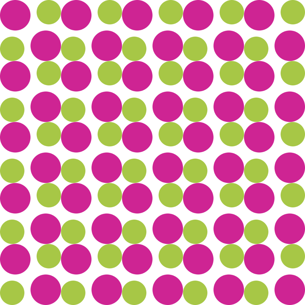


These are all the same pattern, just at different sizes.
At some point the colours will start to mix together, so you no longer see the magenta and green as separate colours. Instead they create a muted pink, which is definitely not Bright Winter. The size at which the colours start to mix will depend on the size of your screen and your distance from it.
It’s easier to make sure that Bright Winter colours stay Bright Winter colours by choosing patterns on the medium to large scale.
Metals, jewellery, watches and glasses
The best metals for Bright Winter are shiny (not antiqued, matte or brushed). Silver, platinum and gold will all work, as long as they are light and shiny, not dark and muted.
Less shiny metals can work if the other elements of the item — stones in jewellery, band and face in a watch — are bright enough.
Beautiful stones for Bright Winter jewellery are diamonds, rubies, emeralds, blue and pink sapphires, and many colours of Swarovski crystals. Clear and sparkly is often better than opaque, and always better than anything earthy.
Glasses frames can be any of the metals discussed above, black, or any of the colours in the palette. Coloured plastic frames are more likely to be bright enough, while coloured metals often aren’t.
Hair colour
If you’re a Bright Winter and you want or need to colour your hair, I’ve collected some options in the pinterest boards below.
Most of them are for medium to dark brown to black hair, because most Winters have these colours.
Also worth noting, the Bright Winters I’ve seen go grey, do so spectacularly.
Makeup
Complexion makeup (foundation, concealer, etc.) needs to be matched to your skin. If you have trouble finding or matching foundation, I have a blog post that might help.
The “colour makeup” comes from your Bright Winter palette.

Bright Winter icy colours and neutrals
Your whites, greys, black, taupes, and icy colours are your neutral eyeshadows. The greys and taupes are brow colours, grey and black eye liners, and mascara is black.

Bright Winter purples, blues and greens
Or, if bright makeup is your thing, any of the accent colours in your palette for eye looks can work, like a cobalt blue liner or purple eyeshadow.

Bright Winter coral, reds and pinks
Blush and lip colours come from the red, pink and coral area of your palette. All will work on you, but most women will find their perfect shade is somewhere within this range, so trial and error may be necessary here.
Related: Makeup Looks in 12 Tones
The classic Winter makeup look is the pin-up look, with light eyeshadow, winged black liner and a red lip.
But that’s far from your only choice. All the greys make smoky and dramatic eye looks easy.
A great everyday look for the brights is a simple wash of a highlight shade over the lid (like icy pink or pale gold), along with some eyeliner and black mascara, and a lip as sheer or opaque as you like.
If you prefer a more natural look, your bright colours can seem a bit overwhelming, but it absolutely can be done. You’ll just want to choose sheerer (not softer) products, and/or apply less of them.
A sheer product is one which is a Bright Winter colour, but there is just less pigment in the colourless base. A soft one is muted down, and therefore belongs in a different tone, and will dull you down.
I brush off blushes on the inside of my wrist before applying them to clients, to get a gentle barely-there colour that does the face-lifting and eye-brightening job of blush, without being obvious.
Lipsticks can be bought in sheer formulations, or applied over lip balm to sheer them out. Glosses and coloured lip balms can also achieve a natural look, as can stained lips. To create a stained lip, simply apply your lipstick lightly, then blot it away.
For more on your lip colours, see Embracing Winter Lips from Truth Is Beauty.
A note of caution — bronzer is a product for a woman with different colouring. Bright Winter has a crystalline, vivid, clear look. Adding bronzer is like throwing mud on jewels.
Weddings
If you’re getting married, congratulations!
Wearing your suit or dress and accessories (like a boutonnière or bouquet) in your colours will bring out your best on your wedding day.
For Bright Winter, suits are easy — black, grey, white or dark vivid blue work, with a white or icy shirt, and a bright, colourful boutonnière.
A wedding dress in a bright white or an icy colour is perfect, and again you can add colour in the bouquet, jewellery, a sash, and/or makeup.
If you want to go all out, you can make your whole wedding themed in Bright Winter colours. They make for a vibrant, fun and dramatic wedding, as you can see below.
Related: Wedding Inspiration in 12 Tones
Living spaces
Winter colours are not in widespread use for interior decorating, with the notable exception of modern designs.
I think this is because the colours are higher energy and more dramatic than many people expect in their homes. But it can be done, and it always feels good to be in a harmonious environment.
In this Pinterest board I’ve tried to envision what a Bright Winter room or home would look like, and the results are clean, graphic, fun, and yes, sometimes dramatic.
Related: Living Spaces in 12 Tones
Pin this:
