What Your Most Flattering Colours Have in Common
In the post Why the Colours You Wear Change How You Look I talked about optical illusions and harmony, and why and how they affect your appearance.
The upshot is that some colours will make you look terrible and some will make you shine.
The question, of course, is how do we work out which colours do which?
In the 19th century, if you were a brunette you would have been advised to wear purple, red and yellow. As a blonde, gold, pink and light blue were recommended. Blue of all shades was considered good for those with red hair, while orange, apparently, flattered no-one.
We’ve come a long way since then.
These days, we know that such broad strokes don’t accurately describe what it is about a colour that makes it harmonious (or not) with you. While your hair colour absolutely is part of that harmony, “brunette”, “blonde” or “red-haired” is not precise enough to determine your colours.
Your colours will include a rainbow of colours, as well as a range of neutrals.
The question is not whether (for example) purple flatters you — the question is what kind of purple flatters you.
The 3 dimensions of colour
In the modern Munsell system, colour is categorised by its qualities in three aspects: how light or dark it is; how soft or bright it is; and its hue.
Hue (Temperature)
Hue simply means what colour it is — blue, green, red, yellow, etc.
These hues can have yellow or blue undertones, or both, and that’s the colour’s temperature.
The temperature of light is one of the ways we understand the world around us. Light temperature changes from yellow in the morning to blue at midday to yellow in the afternoon. We also perceive night time light (from the moon and stars) as bluish (even though it actually isn’t).
Light temperature also changes with the seasons, which is why the 12 tones are named after seasons.
Because our sensitivity to colour temperature has to do with ambient light, we wouldn’t normally see warm- and cool-coloured objects together in a natural environment. That would be as though one object is lit by early morning sun and one lit by midday sun — time and space just doesn’t work that way — so we see colours of different temperature undertones as disharmonious.
Chroma (Saturation)
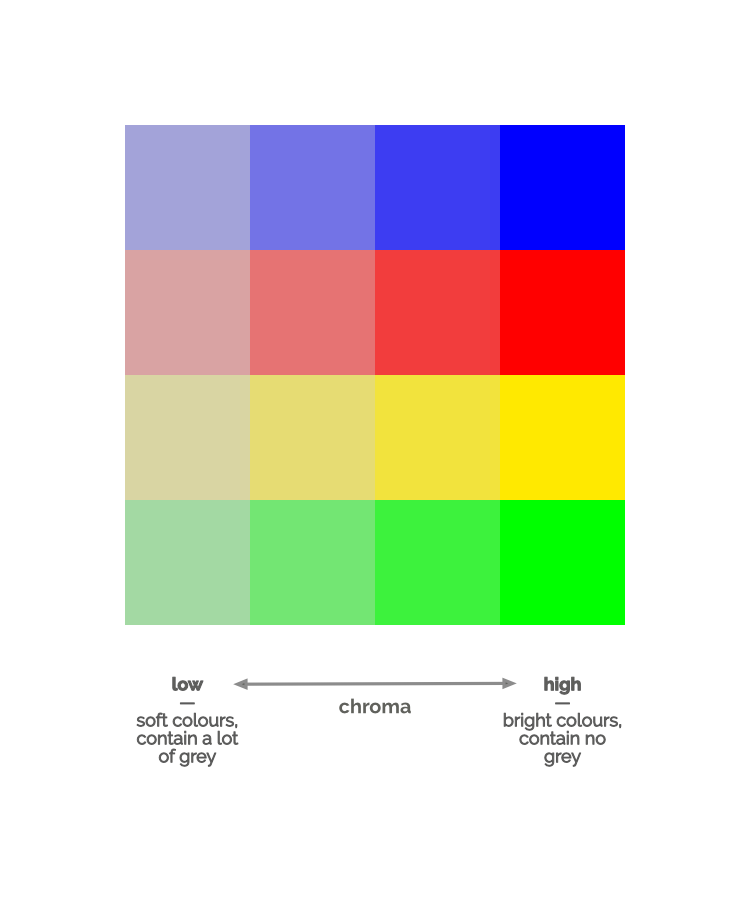
Chroma is the purity or intensity of the colour, sometimes also called saturation.
A colour with high chroma is an intense or pure version of that colour, which we might call bright or saturated or vivid.
A colour with low chroma is a greyed version of that colour, which we might call soft or muted or dusty.
In the natural world, objects that are physically closer to us appear of higher chroma, and when they’re further away they’re lower chroma. Dusty is a good description here because it is literally all the dust and other particles in the air between you and the object that make it look softer.
A bright and a soft colour wouldn’t normally be seen in close proximity in nature, so we see them as disharmonious.
Value (Lightness or Darkness)
Value is the easiest colour dimension to understand — it’s simply how light or dark the colour is.
Physically, the more an object reflects light, the lighter it appears to us (like the sun). So we can think of lightness as how close the colour is to white.
The more light an object absorbs, the less gets to our eyes, and the darker it appears. A true black object (a black hole, for example) reflects absolutely no light, so there’s nothing for us to see. So darkness is how close the colour is to black.
We normally see a range of lightness and darkness in the world, so the difference can be fairly broad before we start seeing colours as disharmonious.
So, let’s get back to our original question. What do the colours that flatter you have in common?
And the answer is:
They are similar in temperature and similar in chroma (brightness). They will cover a range of light to dark, but many of them will cluster around a particular value level.
The 12 tones
The tones are 12 subdivisions of the colour space that human beings can see. Each tone contains all the colours that are similar in the dimensions of colour, and therefore beautifully harmonious. And one of these tones is beautifully harmonious with you.
In the chart above, the tones further to the left are higher in chroma (brighter), while the further right you go, the softer (lower in chroma) the colours get.
The higher tones have more light colours in them, while the lower ones have more dark colours.
And the temperature moves from warm to cool and back again as we follow the circle around.
Your colours belong in one of these tones, because your colours all share similar levels in these dimensions. Once we know where you sit on each, we know your rainbow.
(If you want to read more about the dimensions of colour in the 12 tones, I go into them in more detail in Charting the 12 Tones.)
Pin this:


