Charting the 12 Tones
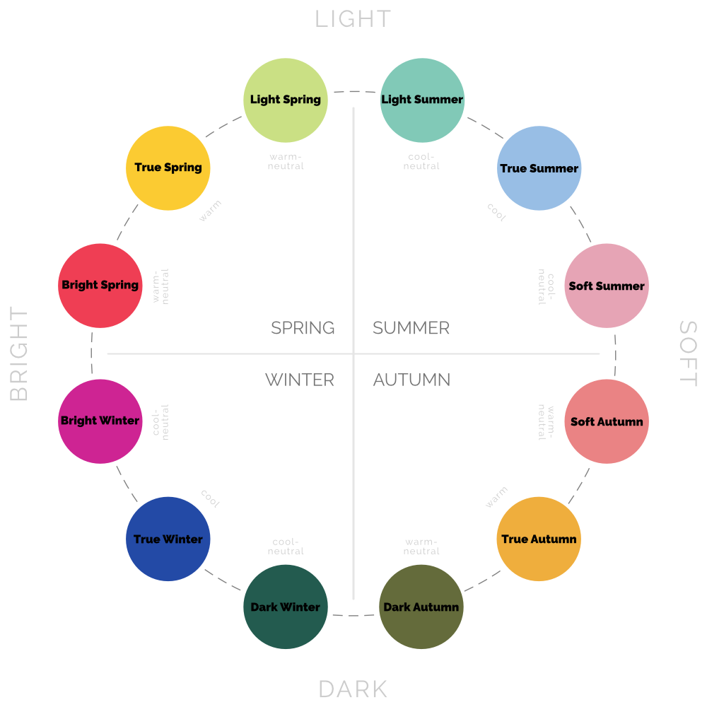
If you’ve read much about 12-tone personal colour analysis, you’ve probably seen a circular chart representing the tones, something like this:
I use this one here on my website, to help visitors visualise the way the tones relate to each other. Spring flows into Summer, which flows into Autumn, which flows into Winter, and then it all starts again.
But if you think about it, there’s actually quite a lot going on here. The chart is showing not just the flow, but also the way the three dimensions of colour shift from tone to tone.
3 dimensions
As a reminder, the three dimensions of colour are:
Hue — the colour itself (eg. red, blue); in particular we are interested in how warm or cool a colour is (temperature)
Chroma — how bright or soft a colour is
Value — how light or dark a colour is
Each tone has a particular range in each dimension, and this is what the tonal wheel is representing — to the best of its two-dimensional ability.
Chroma x value
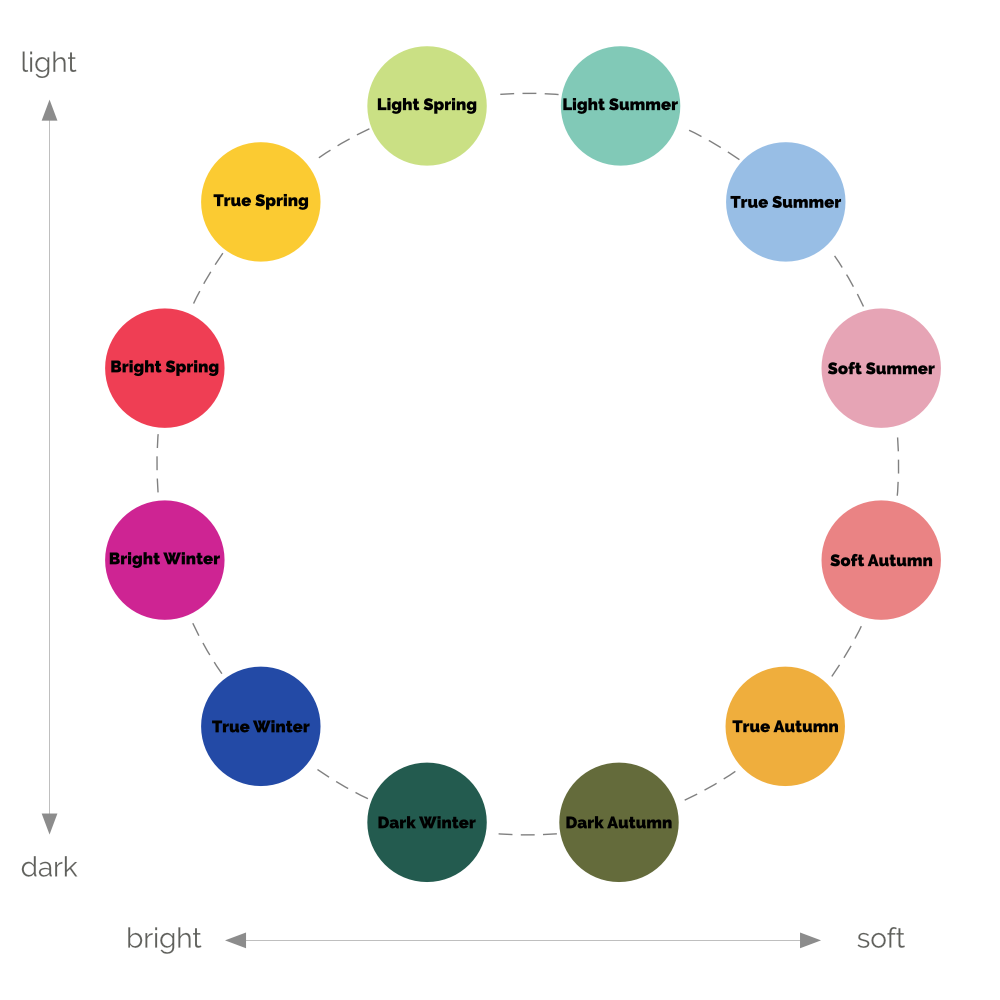
Let’s simplify the chart a bit:
Like all charts, it has an x-axis and y-axis, in this case representing two dimensions of colour (value and chroma). The third (temperature or hue) is not visible — it follows the dotted line around the circle.
Which begs the question — could we visualise this differently?
And of course we can. A chart only has two axes, but we have three dimensions to show, so there are three different charts we could create (including the one above). Each will show two dimensions clearly, while obscuring the third.
All of them are correct, as far as they go, but none alone is the whole story.
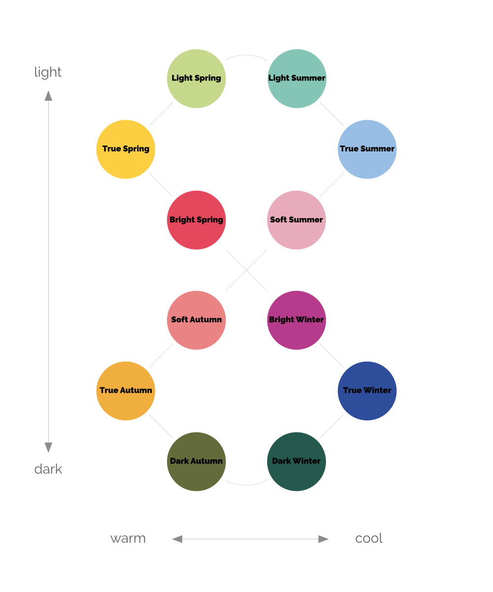
Temperature x value
For as long as I’ve known about 12-Tone Colour Analysis (five or six years now) this is how I’ve visualised the system.
This one shows more clearly how tones that share a temperature setting relate to each other.
See how there's a cluster of the Softs and Brights in the centre?
They seem so different from each other, and in chroma (saturation) they are absolute opposites, but in the two dimensions we’re charting here they are actually similar. All four are neutral (not completely cool or completely warm), and all four are medium overall in value (neither light overall like Light Summer and Light Spring, nor dark overall like Dark Winter or Dark Autumn).
Temperature x chroma
In this final chart we again see a cluster in the middle, this time of the Light and Dark tones, showing that they are more similar than they might appear at first blush. Obviously their value ranges are very different, but here we see that they are all similar in chroma (medium-ish) and temperature (they’re all neutral).
Conversely the Softs and Brights, which were “medium” on the chart above, are now far apart, showing the extremes of chroma different tones can reach.
***
While I’ve mentioned above a couple of insights I’ve had from seeing tonal relationships in these new ways, many more are possible. These are just quick examples of how different perspectives can help us understand our own colours, and those of others, better.
Pin this:


