The Making of the 12 Tones
Last week in What Your Most Flattering Colours Have in Common I wrote about the three dimensions of colour, and how they interact to create harmony (or not).
This week, I want to go into exactly how that translates into the 12 tones.
A little history of the 12 tones
The tones are named for the seasons because that’s where our modern understanding of harmonious colours comes from — specifically, 19th Century impressionist painters’ understanding of the seasons.
Several changes contributed to the development of impressionism — the invention of the box easel and tubes for paint, the development of photography, and new scientific discoveries about the composition of light.
The result was a movement to paint light itself, and the fleeting moment in time.
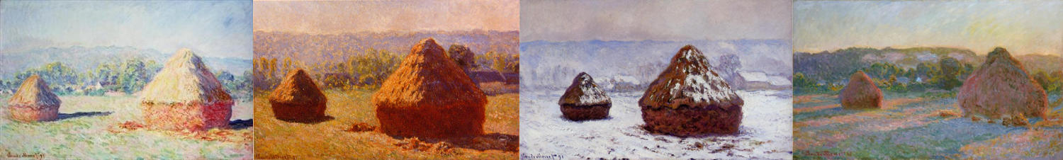
Monet's Haystacks series of paintings
From these explorations painters learned the paint colours they needed to paint the natural world in spring, summer, autumn, winter; at dawn, midday, afternoon, sunset, at night; on a sunny, overcast or stormy day; and so on.
Early personal colour analysts used a broad brush to translate these ideas of temporal, transient colour into the four colour seasons, Spring, Summer, Autumn and Winter. (You would have heard of these if you were around in the 80s!)
At the beginning of this century, the late, brilliant Kathryn Kalisz, an artist and master Munsell colourist, clarified and expanded the four seasons into the much more nuanced and accurate 12 tones that we use today:
The 12 tones
The true tones
We call the true tones “true” because they’re like primary colours, in that you can mix them together to get the neutral tones, but you can’t mix neutral tones together to get true tones.
It doesn’t mean they’re more important than neutral tones, they’re simply more extreme in their colour temperature.
As I wrote last week, the temperature of light tells us about the time of day and time of year. Light shifts from yellow to blue and back again as the sun moves across the sky, and as the earth moves around the sun.
Seeing this yellow–blue shift is an important function of our human vision, and so it makes sense that we are sensitive to harmony/disharmony between colours on this temperature scale.
(It’s interesting to note that people who have red–green colour-blindness — by far the most common type — can easily distinguish between yellow and blue.)
So, a colour that is completely warm is a colour that has yellow undertones and no blue ones, and those colours will belong to either the True Spring or True Autumn tones.
Completely cool colours have blue undertones and no yellow ones, and those will be in either the True Summer or True Winter tones.
When I say that warm colours have no blue undertones, I’m not saying that there are no warm blues — there are! They are blues with yellow undertones, closer to turquoise and teal.
And vice versa, cool colours include yellow, even though they don’t have yellow undertones. Cool yellows are slightly greenish because of the blue undertones – they appear acidic rather than buttery.
Ok, so if a warm colour belongs in either True Spring or True Autumn, and a cool colour in either True Summer or True Winter, what’s the difference?
The difference is chroma (brightness or softness), and consequently, value (lightness or darkness).
Let’s focus on warm colours for a moment. Warm colours, by definition, contain a lot of yellow.
Looking at the chart below you can see that the pure yellow (the yellow at the far right, with the highest chroma) is also very light.
If you think about it, you already know this. Yellow is an obviously, inherently light colour.
A dark yellow cannot be a pure yellow.
To create a dark yellow you have to add black or dark grey or blue to it, which changes not only its value (darkness), but also its chroma (saturation) and/or its hue (colour).*
Blue, in its pure form (at the far left), is a darker colour.
A light blue is not a pure blue. To create a light blue you have to add white or light grey or yellow to it, again changing its chroma and/or hue.
The result is that warm colours — that is, colours that contain a lot of yellow — must be on the lighter side if they are bright or intense. If they are deeper, they must be softer.
So True Spring, which is completely warm and bright, necessarily has a lot of lighter colours.
True Autumn, which is completely warm but softer, has more colours in the darker range.
True Winter, which is completely cool and bright, is darker overall, because blue is an inherently darker colour.
True Summer, which is completely cool but soft, has more light colours.
The neutral tones
So what makes a colour neutral, if warm colours have yellow undertones and cool colours have blue undertones? Neutral colours have both.
If you have a colour with yellow in it, and a colour with blue in it, and you mix them together, you’ll end up with a colour that contains both blue and yellow. That’s a neutral colour.
You can think of neutral colours as all the colours on the way from a completely cool colour to a completely warm colour.
So if we mix colours from a cool tone (either True Summer or True Winter) with a warm tone (True Spring or True Autumn) we create the colours that make up the neutral tones.
For example...
Let’s mix True Summer pink with True Spring coral:
All the colours in the middle are neutral. The ones in between neutral and cool belong in the Light Summer tone. The ones between neutral and warm belong in the Light Spring tone.
As we move from True Summer to Light Summer to Light Spring to True Spring, the colours move from cool to neutral-cool to neutral-warm to warm.
They also become brighter (higher in chroma), because True Summer is soft and True Spring is bright. So True Spring is brighter than Light Spring, which is brighter than Light Summer, which is brighter than True Summer.
The colours don’t shift much on the value (light/dark) scale, however, because they start relatively light on both ends.
So when we mix two true tones to create two neutral tones, the dimensions that they differ on will change (in this case from cool to warm and from soft to bright), but the dimension that they have in common (in this case lightness) is enhanced. Hence, Light Summer and Light Spring.
Let’s try another pair, True Winter and True Autumn reds:
Here, we go from True Winter to Dark Winter to Dark Autumn to True Autumn.
Again, the colours shift from cool to warm, and from bright to soft, but they stay fairly dark because the original colours are both on the darker end.
True Summer and True Autumn:
The colours shift from cool to warm and lighter to darker, but the property that True Summer and True Autumn have in common remains: low chroma (softness). So on the neutral-cool side we get Soft Summer, and on the neutral-warm, Soft Autumn.
Finally, let’s look at mixing True Winter and True Spring:
Again, these tones have chroma in common, in this case high chroma (brightness), so we get cool-neutral Bright Winter and warm-neutral Bright Spring.
Putting this all together, let’s revisit the 12 tone circle.
Now we can clearly see how it moves from true tones to neutral tones, light to dark, and bright to soft, and back again, as we follow the circle around.

*In fact, we barely perceive dark yellow as yellow at all, but we might describe it as gold or olive or khaki or even brown. Dark and softened versions of yellow, orange and red all are perceived as distinct colours, which probably has to do with the fact that skin tones reside in this area of colour space, and those colours are of primary importance to us. Blue, green and purple variants don’t change in this way.
Pin this: